
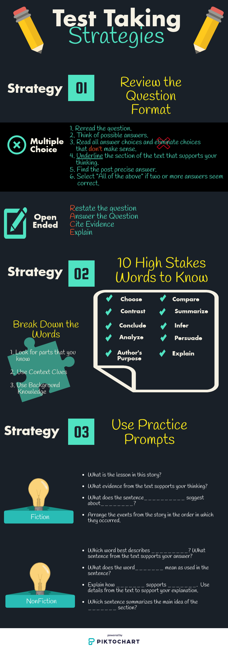
I created a test taking strategies infographic for students in grades 3-5. With all of the assessments our students are exposed to, it is necessary to equip them with test taking strategies they should use to be successful. I chose to use Picktochart to create our infographic because the vibrant colors and images will easily capture our students’ attention. I love creating anchor charts as visuals for my students although I am certainly not the most artistic individual. Creating infographics is a great way to create digital anchor charts.
The instructional design process that we followed to develop this assignment was the Backwards Design Model. There are three stages to the Backwards Design Model. The first step is to identify the desired results. In this case, my desired result was to increase student achievement on reading assessments by teaching them to use the outlined test taking strategies. The next step is to determine acceptable evidence of learning. I chose the test taking strategies most associated with reading assessments for our students to practice. The final step, design learning experiences and instruction, is the step where the desired result transforms into action. The students practice implementing the test taking strategies in daily assignments.
My project can be used for teaching or supporting a classroom lesson in multiple ways. I would begin by creating a poster of the infographic to display in my classroom. I would refer to the infographic to reinforce the purpose of the strategies prior to students completing assignments or common/formative assessments in class. I would also create mini copies of the infographic for students to include in their interactive notebook. Next, I would model how to create an infographic and have my students create their own versions of the test taking strategies infographic using Google Slides or Powerpoint. Students will have to show evidence of how they used the strategies while completing their assignments or assessments. Using infographics in the classroom is important because they reinforce the theory that people learn better when they are exposed to images and texts simultaneously.
Some of Mayer’s multimedia principles that we used were the Spatial Contiguity Principle, Temporal Contiguity Principle, and the Multimedia Principle. The Spatial Contiguity Principle was used to ensure that our words and images are in close proximity on the infographic. I also used Temporal Contiguity and Multimedia Principles to ensure that our corresponding words and images were presented simultaneously so that our audience can retain the content better by seeing the words and pictures together rather than words alone. The elements of visual literacy that we used are color, lines, balance, and size/scale. We used a solid, dark background with vibrant colors for the graphics and text. Lines were used to separate the content. We used balance, size, and scale through our various text sizes and choices of images on the layout.
An infographic is a chart or diagram used to display data or information. A poster is a large image used for decoration. The difference between the two is that an infographic is used to display pertinent data or information; whereas, a poster is used for aesthetic representation purposes. Students can use infographics to demonstrate their in depth understanding of a concept. They can use posters to create a visual representation of their knowledge.
I really enjoyed this assignment. It gave me some ideas about how to create visual displays for my students next year instead of creating so many anchor charts. Overall, I think Picktochart is an awesome resource that is great for high school and college students who are working individually to use to demonstrate their understanding of content.
Photo used under Creative Commons from verchmarco
